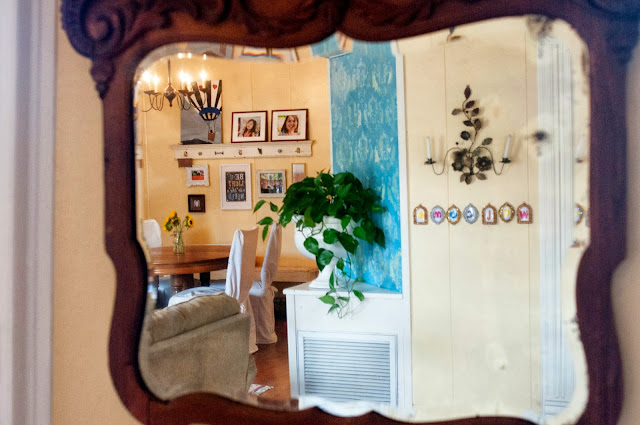
Recently Laura came over and did something I've been wanting to do for a very long time - took pictures of our home!
In the past I've shied away from this. Even taking the "before" pictures so I could have "after" pictures just felt so pretentious to me. Why? I don't know - I'm overly cautious and sensitive at times. I thought if I did this, it might act as some sort of shrine and testament to our work... It might seem like I'm trying to boast in any "decorating skill" I have... I didn't want to give people the wrong idea that I fancied myself some sort of house artist that was keeping a portfolio...
And then it came to me: I needed to seriously take some sticks out of somewhere and lighten up. It's just a silly house and some stupid pictures.
So here they are guys! We'll start out with the living room.
Come on in - you can crank the old doorbell for fun, but it doesn't work anymore.
This mirror (above) was taken from my childhood dresser. You do not want to know what kind of massacre is behind that mirror to get it up there. It is very heavy, and thus, harder to mount.
I was teasing Laura that the collage up there is a shrine to her photography. Every picture up there is one she took. The painting is also from a dear DEAR friend, Holly. The plaque that hangs from the shelf sat in my grandparents house for many years. Needless to say, this is a very special and cherished collection to us.
If you're wondering, I'm not a huge fan of ALL the turquoise anymore. The shelves used to be an olive green, and they really are worlds better than they used to be, but if we were staying in this house, I think I would have painted them white eventually. I am always trying to strike that balance between having color and character but also class/minimalism. I think if our walls were white, this turquoise would not have been an overkill, but so much yellow and so much turquoise together, I'm just not sure of. For me, the white would have given it that more "classy/simple" look I am really searching for. Minimalism is truly an art - one that I have yet to master. For our new home, I have goals of making it a tad less romantic and girly, and a little more simple and classy.
But you know what? It IS really easy for me to obsess over the details and the "should be"s and "coulda beens". It IS really easy for me to look at Pinterest pins of houses and think about all the things other people thought of that I didn't, or want to emulate them precisely. But this is us - these are the things that were given to us lovingly from other people, or the $1 finds I just happened on at the yard sales. I've always loved French design, and that means to have curves in things and scrolls and chunky frames - and if that changes on Pinterest tomorrow, it will still remain true in this house. And those are just a few of the things that scratch the surface of what makes a house a home. It's taken me a while, but I have peace with that now, and though things will almost always be in rotation, and I will continue to be inspired by other homes and Pinterest pins - some things will still remain with that special Wilson family seal on it that we have come to be comforted by. "And that's"...(best Stuart Smalley voice) "O-kay."
Just be cool and pretend like that white slipcover doesn't have chocolate fingers all over it. Thanks guys.
Do you see that green dragon above the large turquoise shelves? It's one of my favorite things. I saw it in a guy's yard as he was closing up his yard sale the day after. I slammed on my brakes like a mad woman and shouted out my window if he would take a couple bucks for it. He did and I've never regretted the way he backed away from me and his hands shook with fear as I ran up with money waving wildy and frothed at the mouth as I took his dragon and handed him the cash.
My precioussss....
Well, that's the living room area. As I said before, tomorrow it's on to the kitchen!


.jpg)

No comments:
Post a Comment
I can't wait to see what totally excellent comment you will post! Go ahead, do it! Don't mind me....